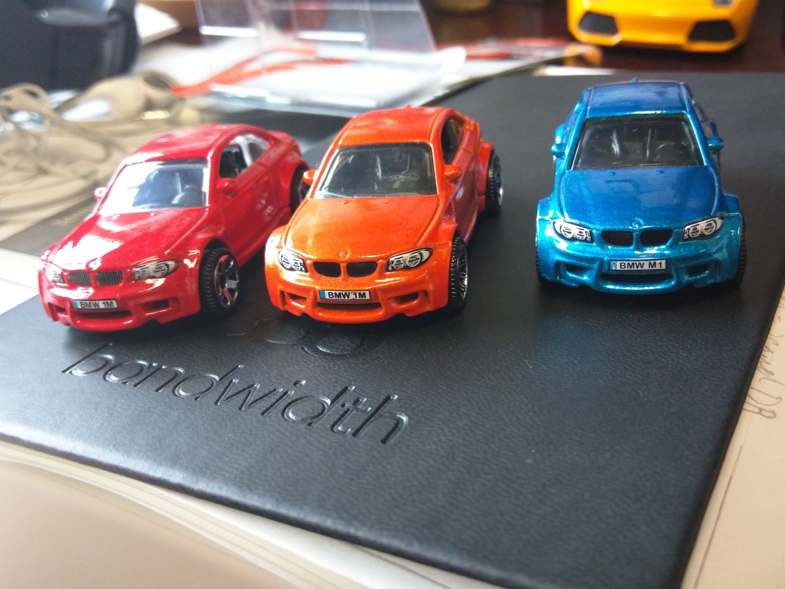
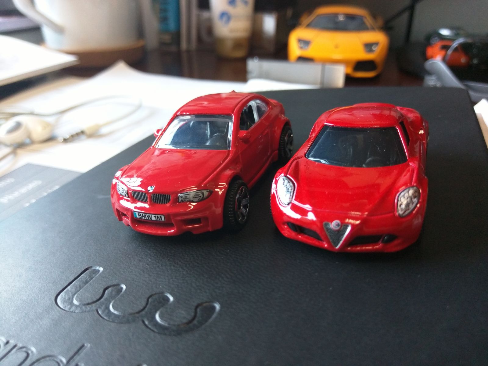
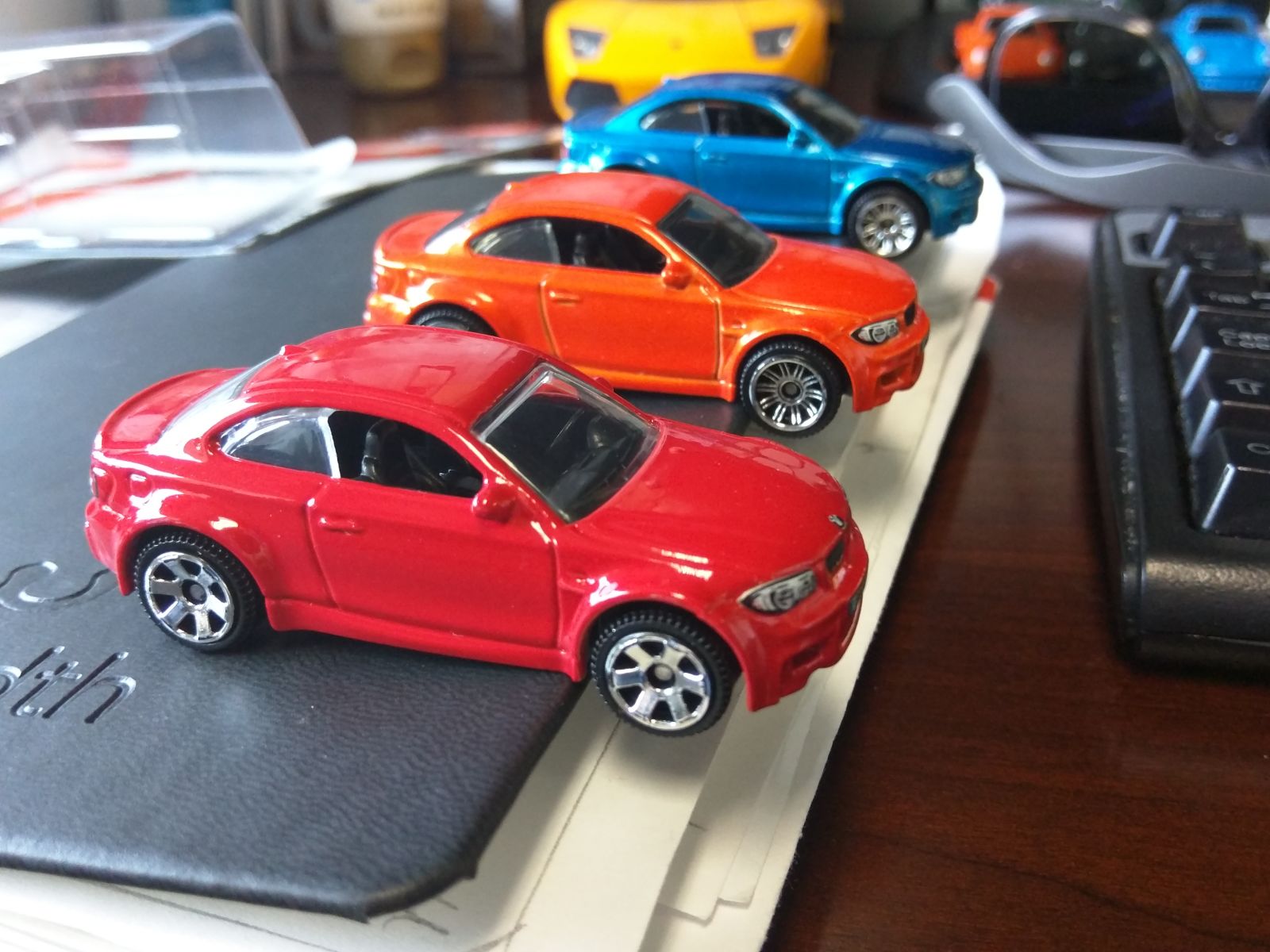
I finally found the red BMW 1M by Matchbox today and of course had to compare it to its brothers, Orange and Blue.
First Glance
Matchbox, THANK YOU for finally adding the missing BMW roundel on the hood. It was glaringly missing on Orange and Blue, and now finally on Red we can enjoy a full set of tampos!
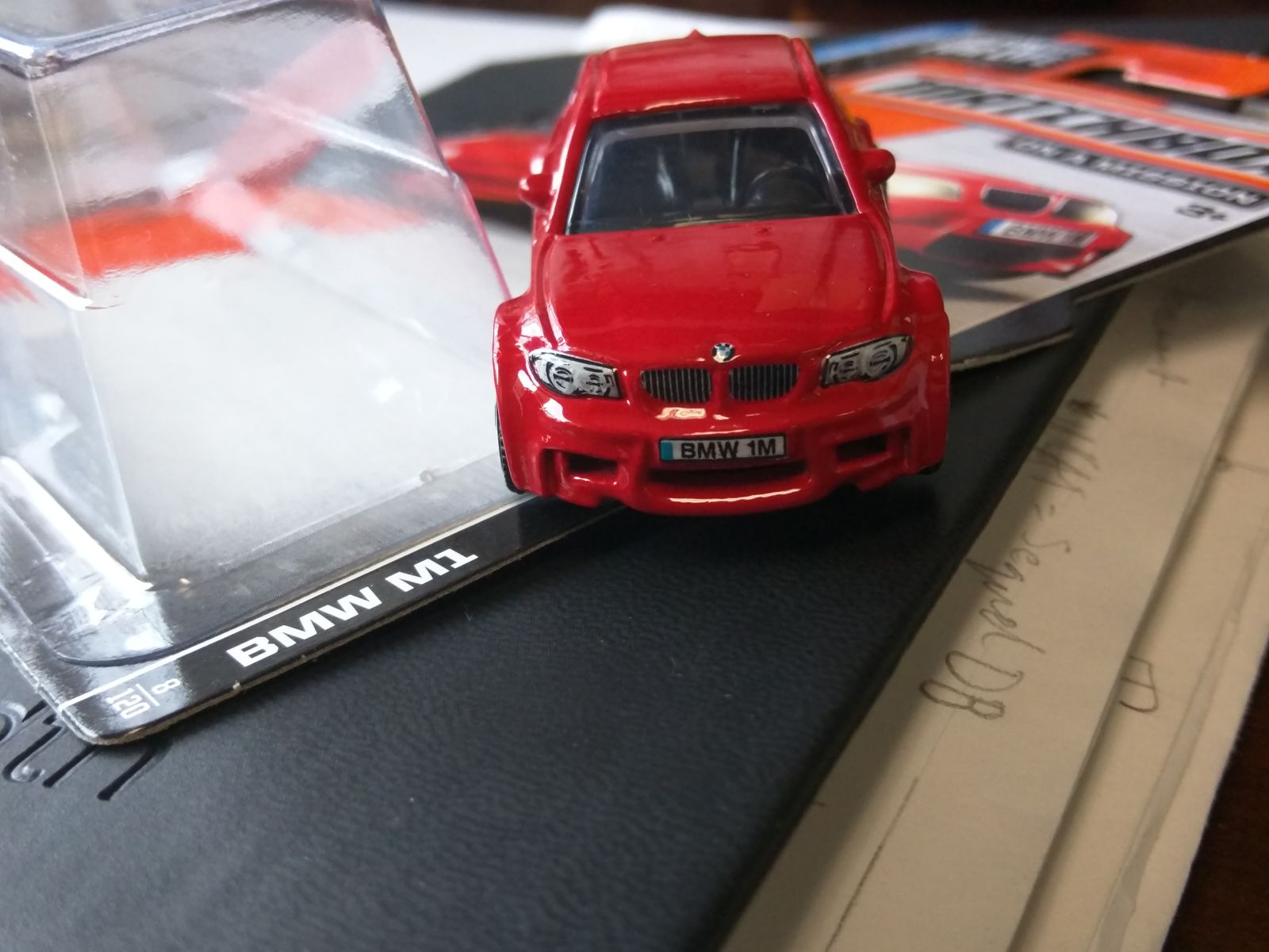
Speaking of tampos, I also really like the little vertical stripes on the kidney grills that Red has. Orange and Blue could have definitely used them as well.
Name
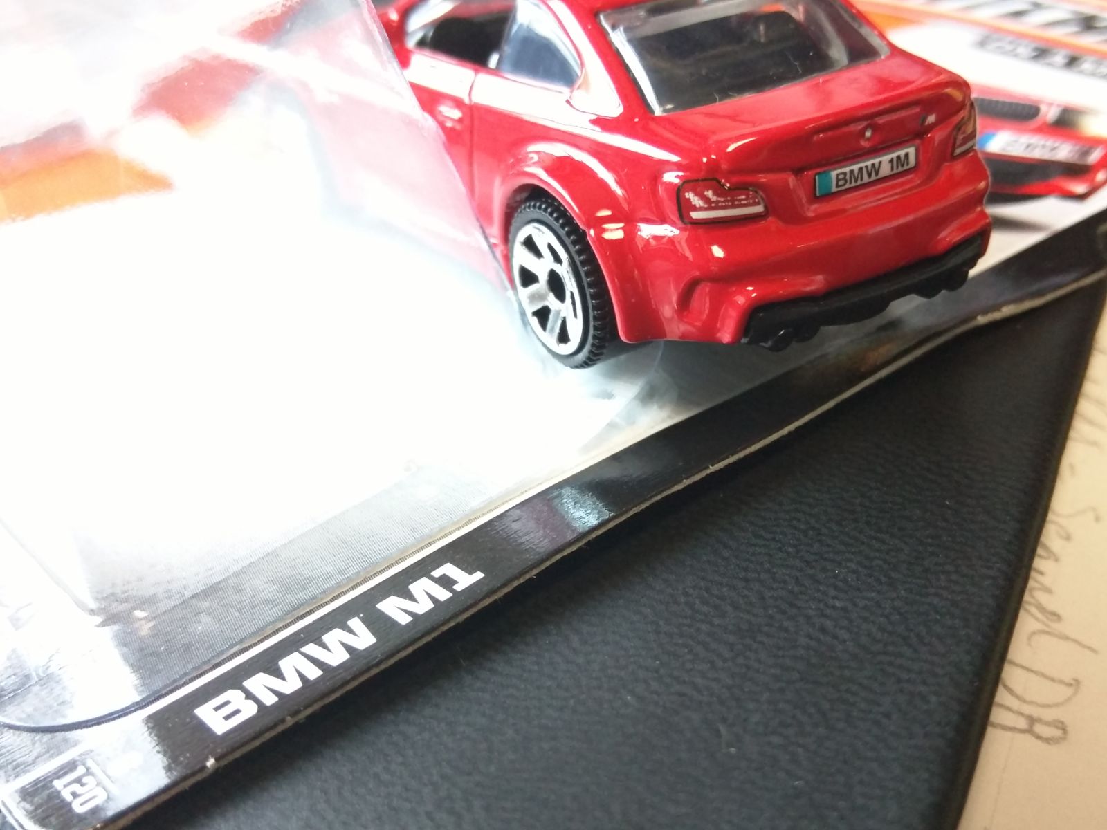
It’s a 1M again! Well, sort of. The card still says “BMW M1,” but the car in the graphic says “1M,” and the license plate says “1M” as well. I will take this as a half-admission by Matchbox that they made a mistake on Blue, calling it “M1.”
Paint
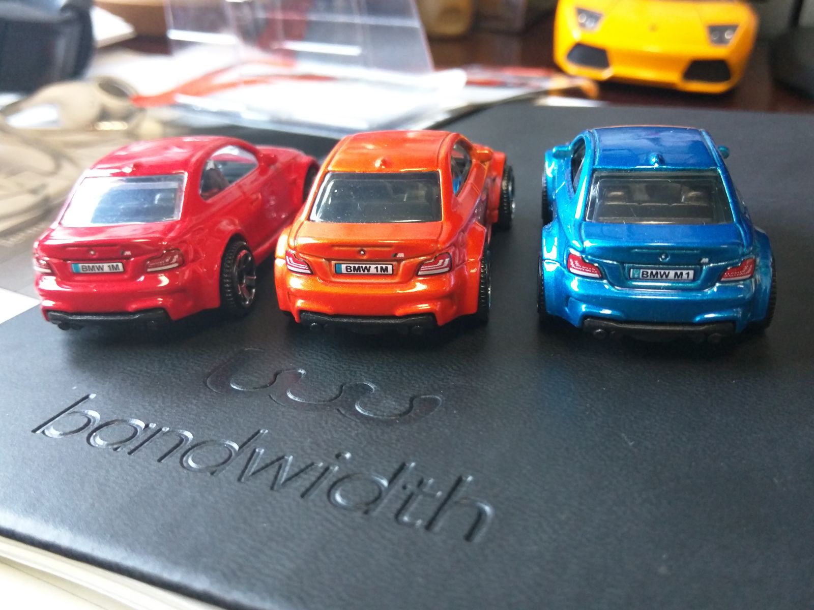
Blue definitely has a leg up on both Orange and Red here. The blue coat sparkles, feels great to the touch and is just overal smooth and beautiful. Orange is my favorite in terms of color, but Blue blows it out of the water in terms of finish. Red is just okay. Definitely better in real life than in photos, but still takes only third place.
Perhaps a slightly brighter red like on the Alfa 4C would’ve worked, but this red is just a bit to plain and drab. It looks a little thick in places, too.
Wheels
Why mess with a great thing, Matchbox? Orange and Blue had the perfect wheel for this car. Why mess with it? If you were going to switch it for anything else, you should’ve made it the 5-spokes. Not these ugly 6-spokes.
/end rant.