
I got a text from a friend in Colorado this morning asking what it was like to be living in a hotspot. I don’t really notice a difference, and am not worried about getting sick. But with the rise in cases in western states, it got me curious, as you haven’t heard a lot about Colorado. I did some Googling, and found these stats.
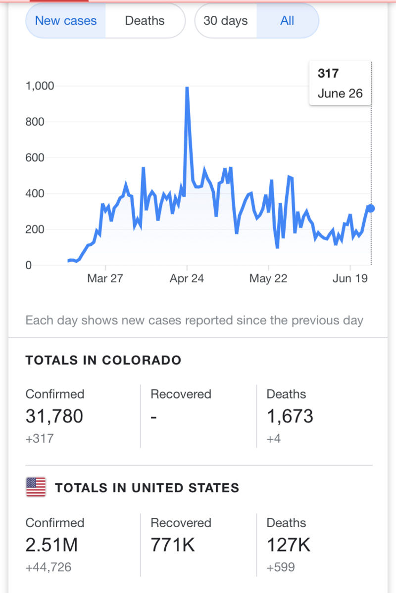
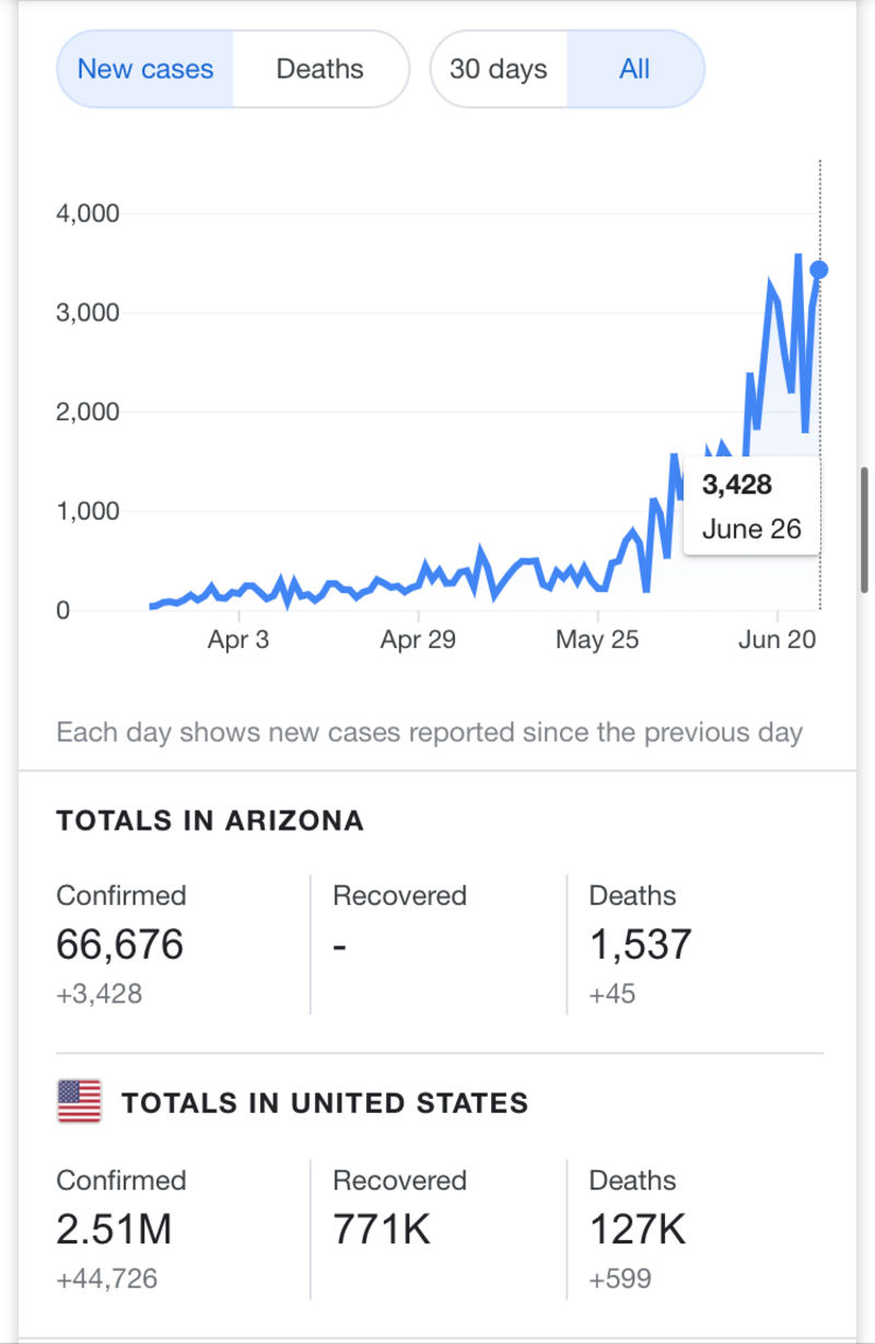
The scaling is a bit different on the graph, but both states seem to have a similar infection rate up through May. June is when Arizona took off and became a hot spot. However, despite Arizona have twice as many confirmed infections, we have less deaths. I’d assume Arizona would have many more deaths on account of our infection rate, and how many older people we have here. We also have almost 2 million more people in the state, and the Phoenix metropolitan area is about twice as big as the Denver metropolitan area.
I have no idea the reason behind any of these observations, just something interesting I noticed.