
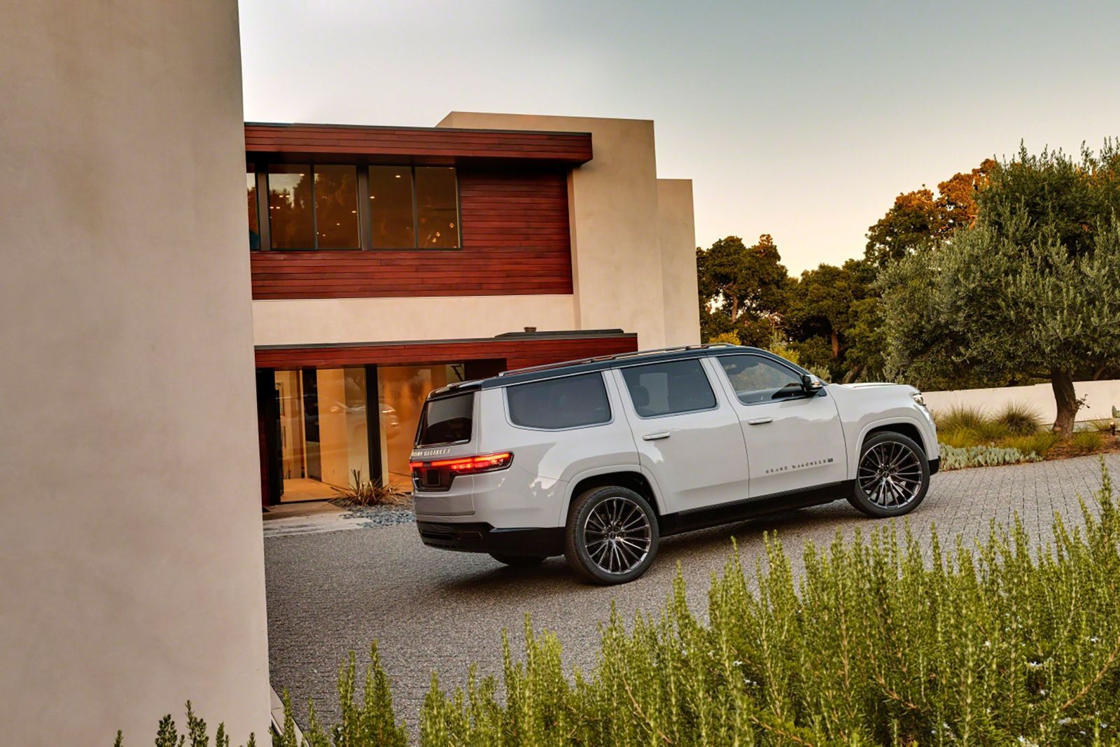
This is my attempt to make it appear more grand and less wang
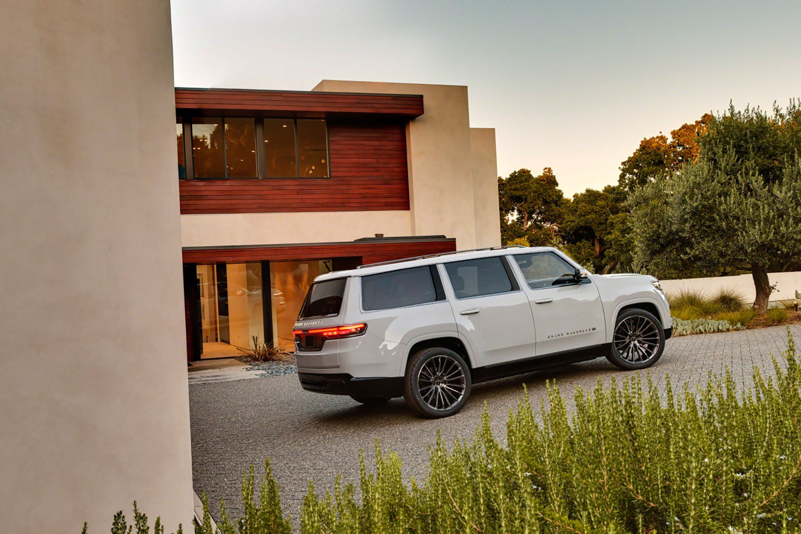
The front isn’t the bit that bothers me, its this view, where it looks like a Land Rover Defender 5 and a Honda Pilot in the worst ways. That upkick in the rear glass is so wrong. The rear has no dimension to it. The pillars are aweful and look less styled and more “well, we gotta have pillars, might as well use these”. The roof floating effect isn’t working, is it supposed to look like the roof was sawed off but a convertible shop in Murmansk?
In my opinion (and there are many going around) the thing that made the GW work was the glass area and the roofline.
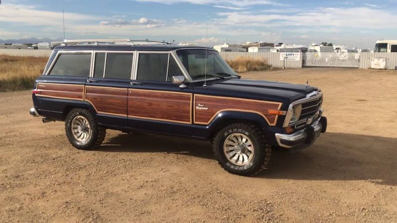
The roof feels magically suspended over a wheelhouse of glass. It’s delicate and elegant.
While I agree you can’t get away with that in the modern world, there are tricks to attempt it. Keep the window rake steep, the roofline sharp, mask the width of the pillar behind glass or through painted out black sections and why oh why did they think a floating black roof was a good idea I have no idea.
So I axed the upkick, slanted the rear glass more for depth, thinned out the pillars as best I could with painting, brought some rake back to the A-pillar, and color-coordinated the roof.
Its not great, and I’m no designer, but at least it looks less like a PilDiscTahoe and more like something that was designed to invoke a past.