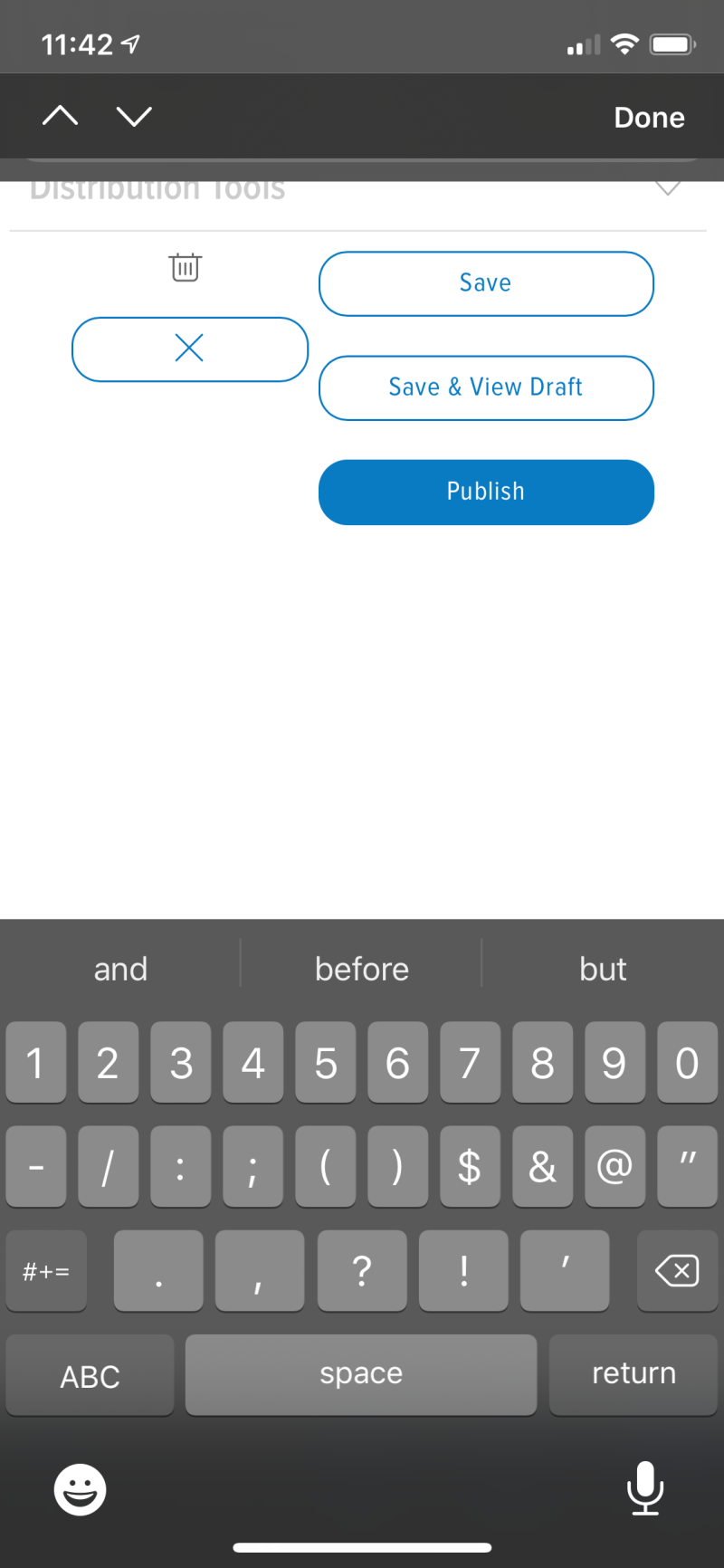
Share bar in the middle of the screen because why not? Typing is also FUBAR for me, they have somehow managed to split the iOS keyboard so that the bar with the Done/close keyboard button is at the very top of the screen and as soon as you try typing the text box moves itself above that bar (iOS making sure you can see what you are typing) but since that bar is the top of the screen it breaks everything and you can’t see what you are typing anymore. I typed this post like this: