It's closer to what I want to see.
Wheelerguy
8/11/18 9:30AM
•
Filed to:
Fonts
Fonts
72
10
1
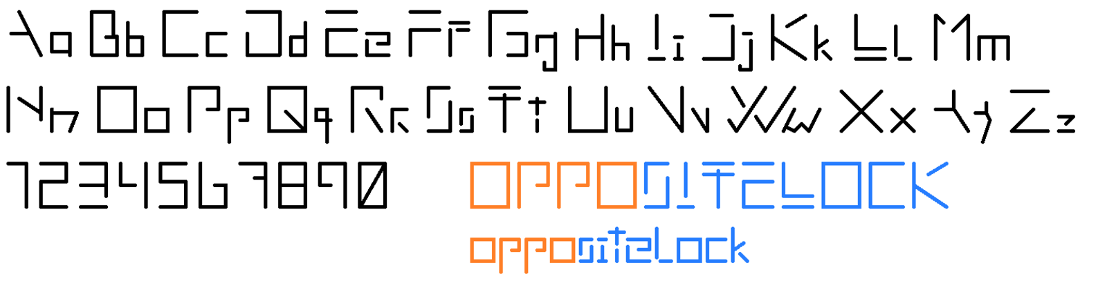
Admittedly, still not the ideal, but I reckon it can work. Ss, Tt, and y are problem spots.
Advertisement