
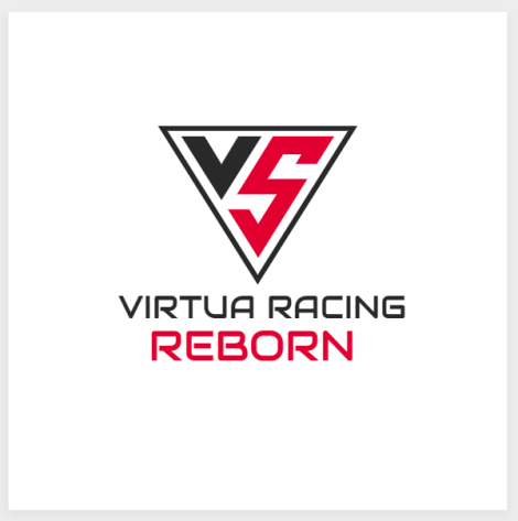
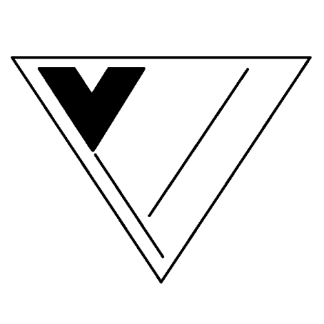
It is a logo. Or at least the basis of one.
From that I went on Paint and created this draft. I’ve, admittedly, run out of ideas to create the R (middle) and REBORN (right column) text, but I feel like the base design is sound.
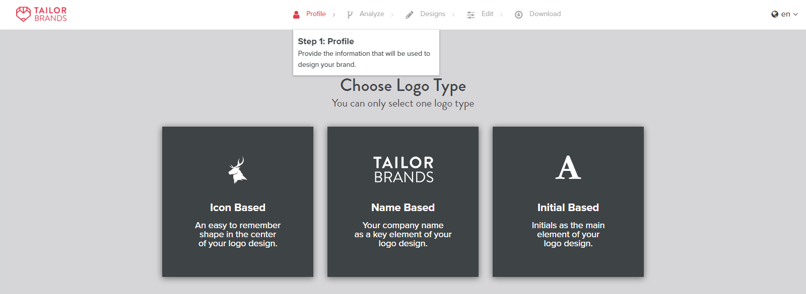
I also went shopping around for other logo makers and ran into this:
Advertisement
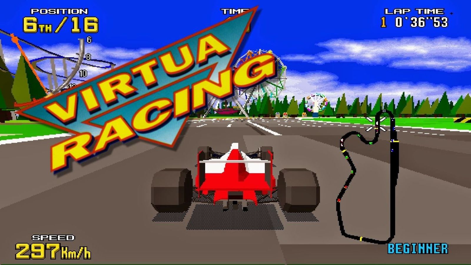
Now, you might be thinking: “Wheelerguy, you’re not actually making a game.” True. This is little more than a way to satisfy my curiosity, but Virtua Racing doesn’t really have much of a logotype—
Advertisement
—wait they do but as you can see, it isn’t much.
So the question, then, is this: is a symbol logo good enough? For a game franchise, are symbols a better way to stamp your space?