
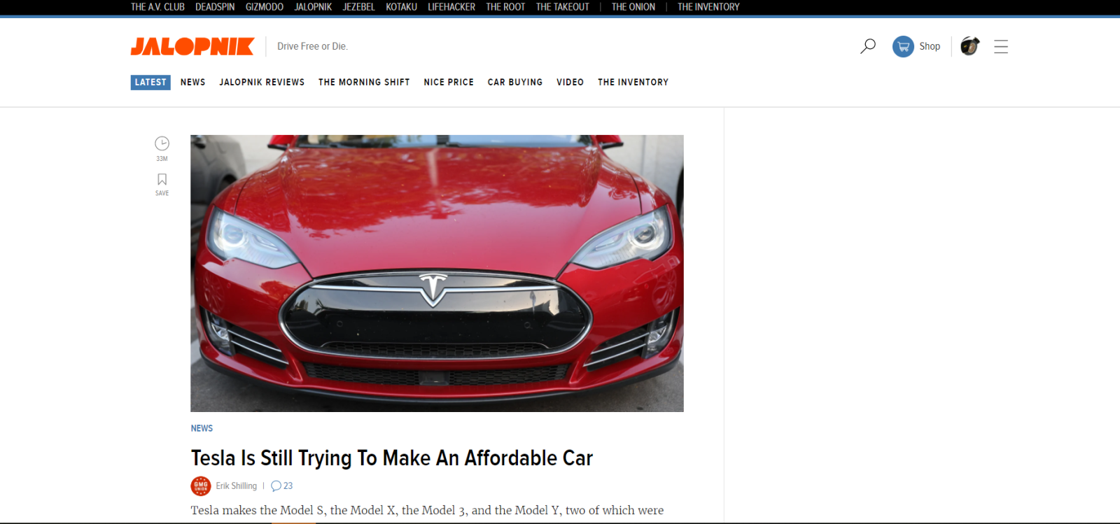
Here is my version of the Jalopnik front page with all my custom filters enabled - it basically keeps Jalopnik’s layout at the early-Kinja format that was fairly readable. The only thing cluttering up my FP now are Shilling’s awful takes.
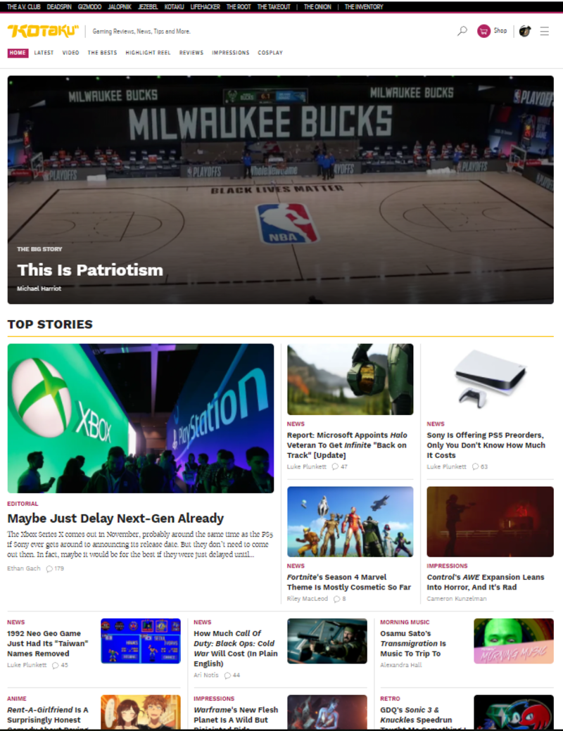
Here is Kotaku this morning with no filters enabled except the standard ad blocking. How is this a user friendly layout? What am I suppose to read? What’s the newest article? Why is a video game block feature posting about basketball and social issues? I use to pop over there maybe once a week to read up on some games I was interested in, but now it’s too cluttered and painful to visit. Who hired these web designers?!
Advertisement
Thanks for listening to my rant.