
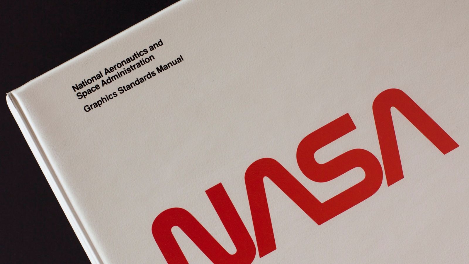
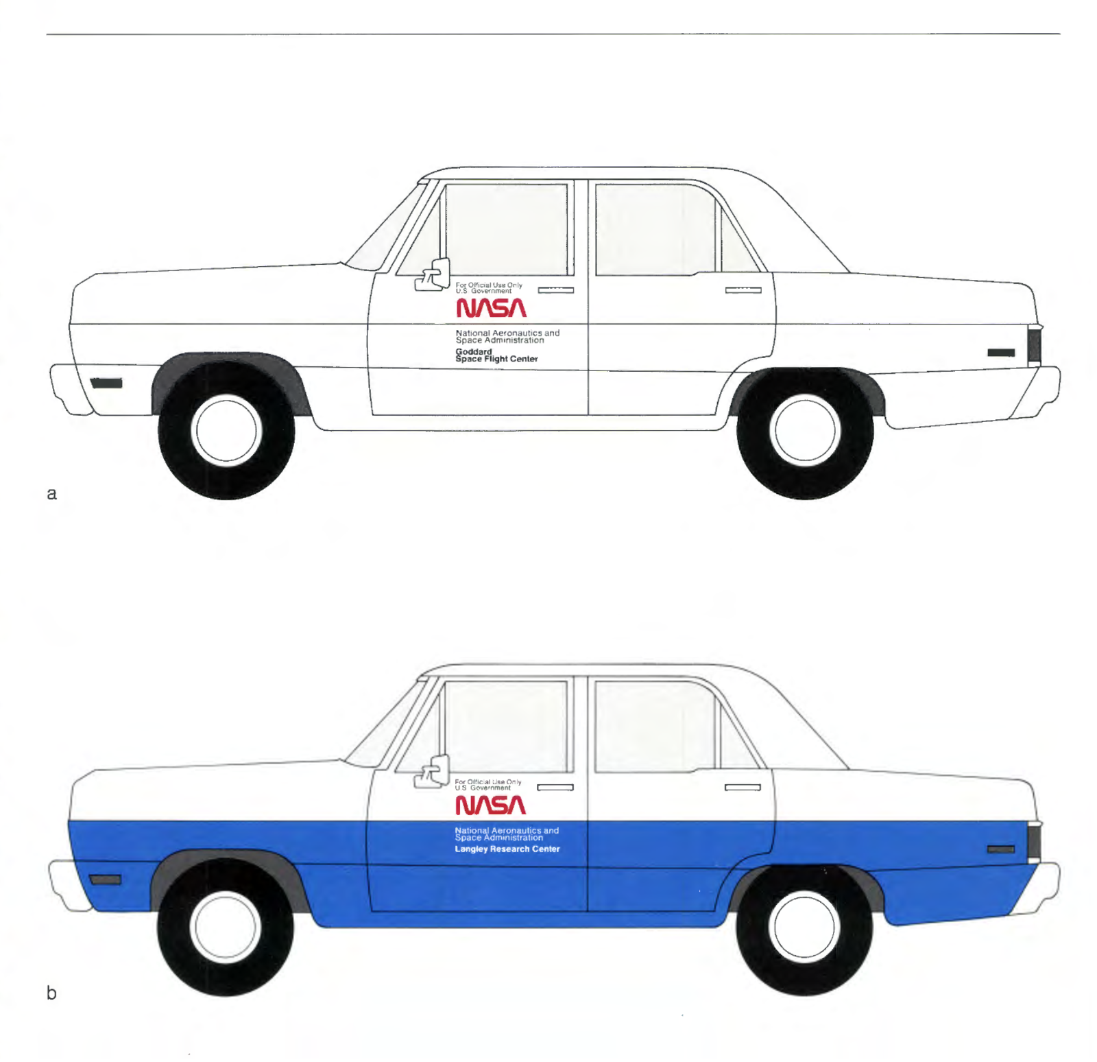
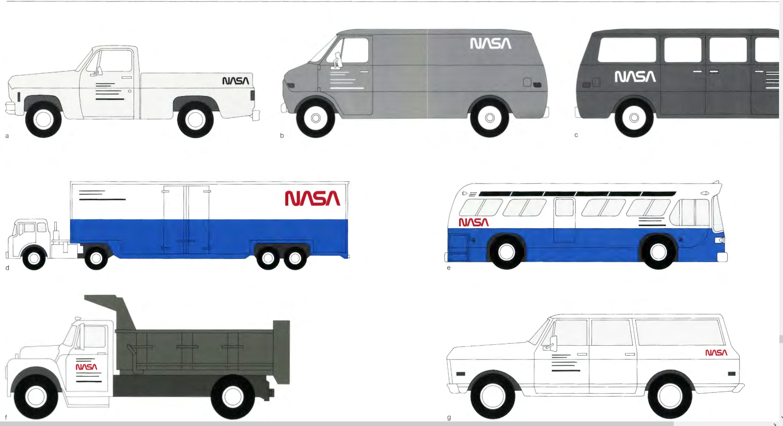
In 1976, NASA produced a graphic standards manual for internal use, for all applications of the logo, and how things should look. They covered everything they could think of at the time, from paper-based communication to spacecraft.
It specified the official typeface: Futura. Which you might also recognize from Stanley Kubrick’s films.
Advertisement
Which seems a bit on-the-nose, I admit. But it’s pretty hard to argue.
Advertisement
Advertisement
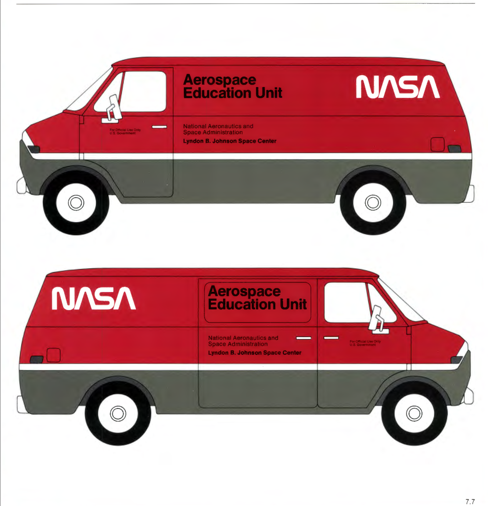
It’s still a reminder for me of the future I expected as a kid. So optimistic, so clean, like the first step toward Star Trek TNG. I wanna live in a world where there’s an Aerospace Education Unit.
Advertisement
You can pay people for a hardcopy, or you can download it yourself here.