
I’ve mentioned in the past that I invented a pretty high-tech sealant/ceramic/composite/whatever the fuck term you want to call it car wash product that repairs minor damage to the clearcoat and leaves behind a hardened surface coating to protect against further damage. Well we’re in the final phases of testing before nationwide rollout! This means it’s time for all the little details to start to get addressed. And since marketing is convinced every product needs the same label design template and should never EVER deviate, I decided to see what I could come up with on my own.
To show the potential of our products via just our labels, I mocked up some rough ideas of what the new product labels *could* look like. And tell me, wouldn’t you want to go through a wash knowing THESE bad boys were online? (descriptions and directions not yet final!)
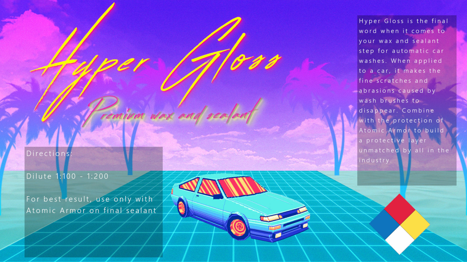
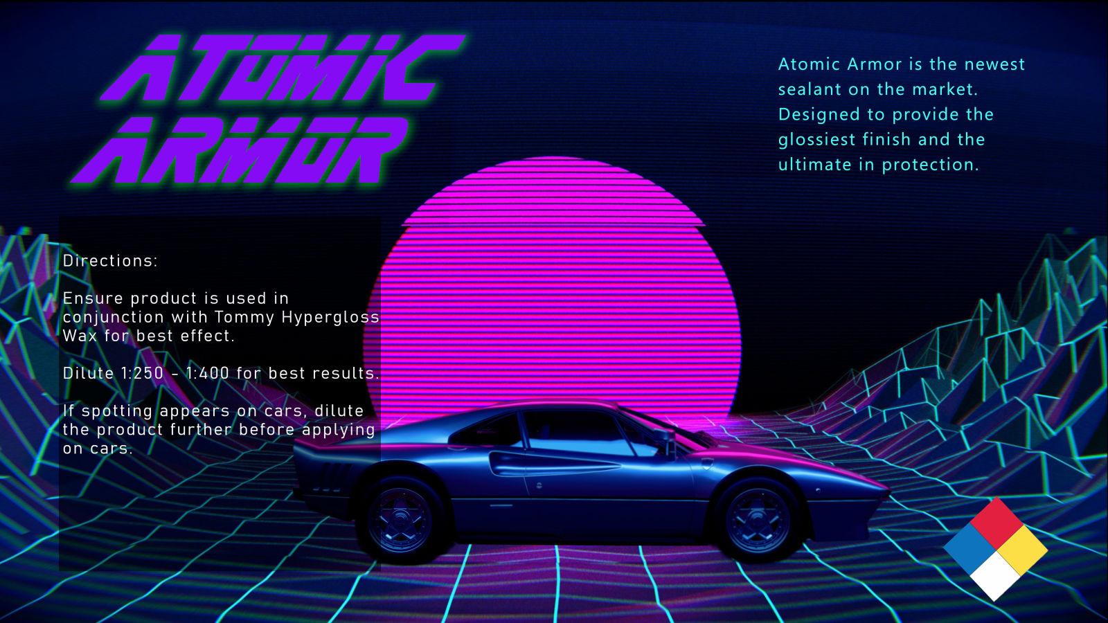
Both products have a “shadow” dye added to them (long story short - it makes the product seem to glow a different color than what it is) and the base color matches the font color with the shadow dye being the same as the drop shadow. So HyperGloss is a neon yellow with a pink glow dye, and atomic armor is obnoxiously purple with an “atomic” green glow to it.
Our current labels? Well this is a small image, but here’s what a drum looks like with our current label:
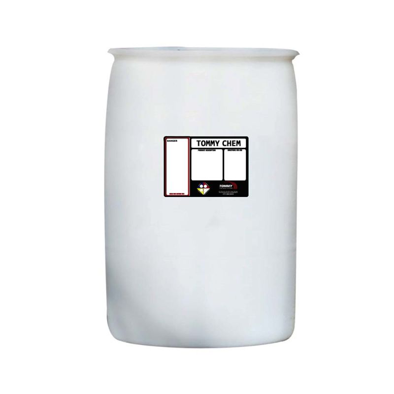
Yuck.
These designs are far from final, but I’d much rather see some vaporwave inspired neon dreams stuff than a label that screams “The bare minimum”.