
And the crowd goes mild.
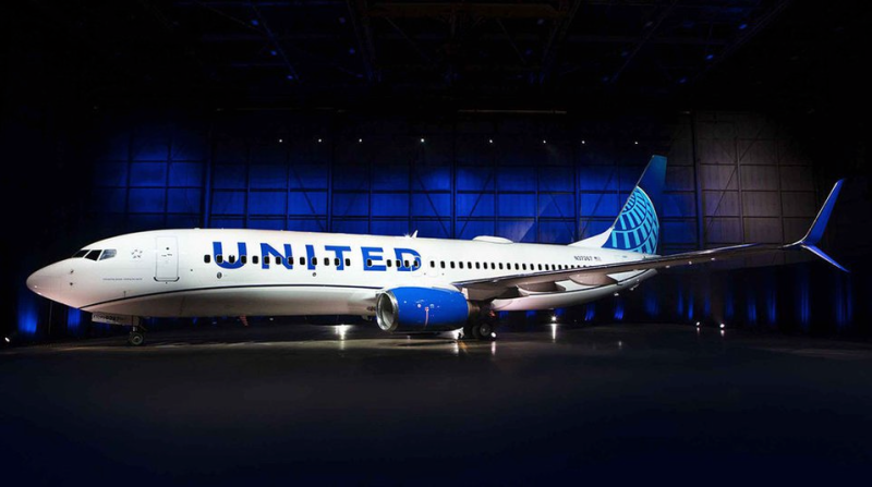
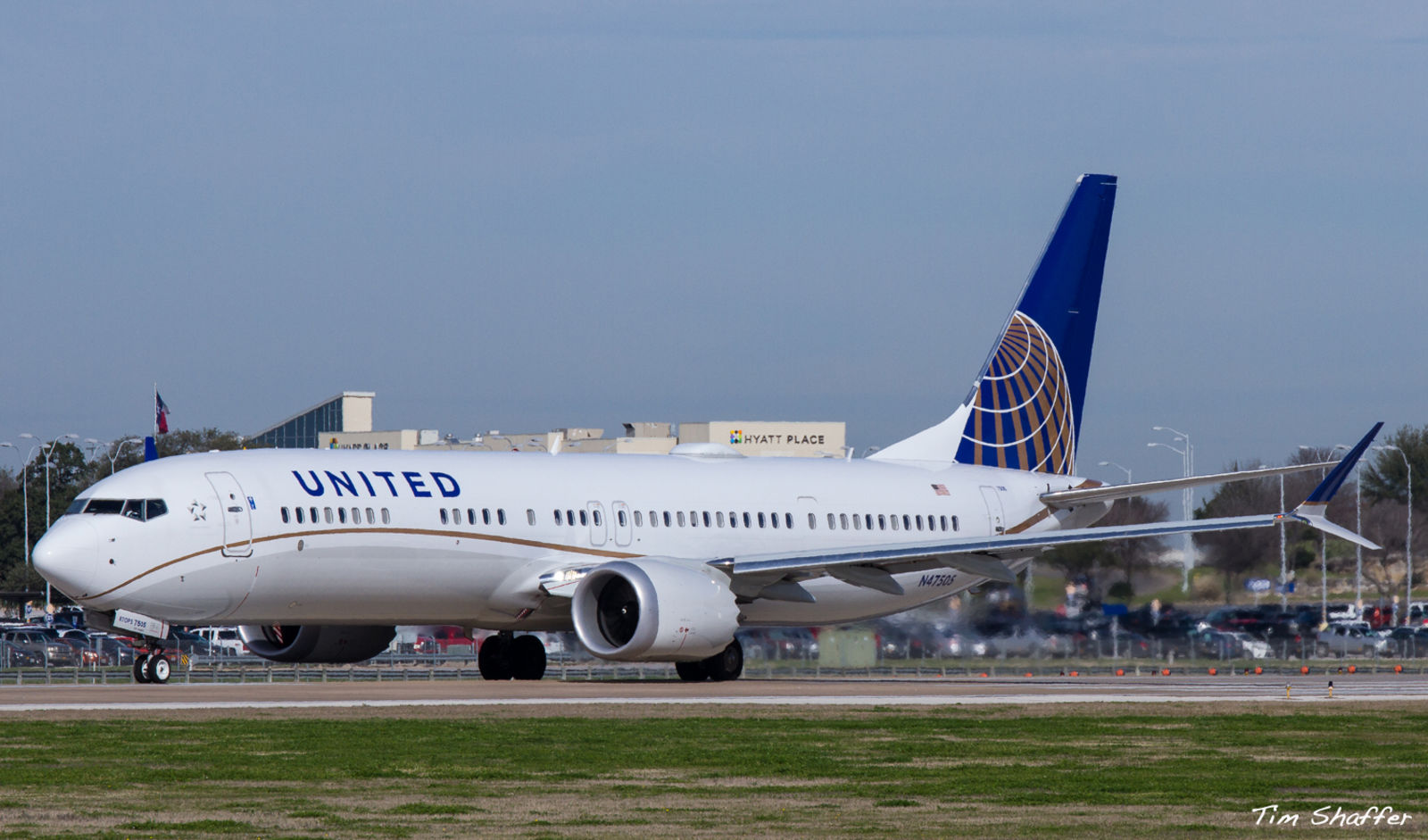
This was a long-anticipated reveal, at least in aviation circles. And while there are some differences, there will be no doubt about the continuation of the recognizable branding. And I guess that’s what’s important. Gone is the gold from the globe on the tail, replaced by a light blue, the dark blues are brighter, the United is made larger and moved down the side of the fuselage, the engines nacelles are painted blue, and a blue, curving cheatline is added. In a certain sense, it’s almost a retro livery, and very much in line with other trends these days.
It is certainly not unattractive, but I think they hit the sweetspot with the livery they used on the MAX9, which also gave us the curving cheatline.
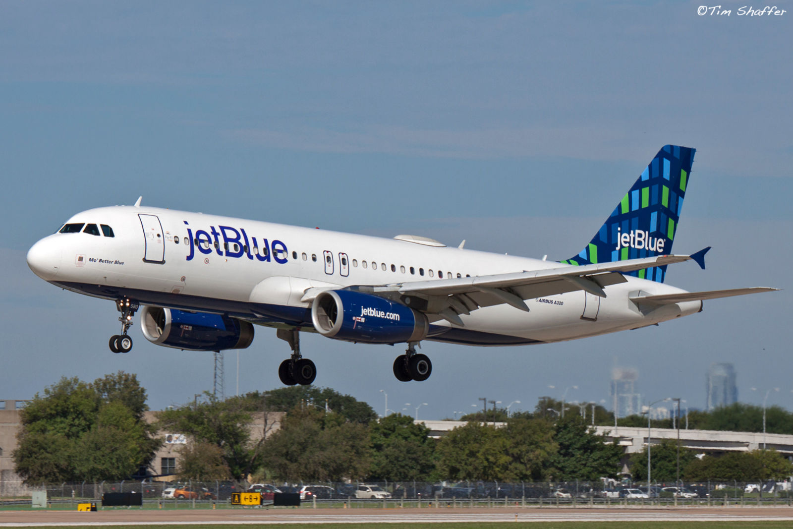
Comparions to JetBlue are inevitable, especially since the blues are more similar now, and the large writing on the side is similar.
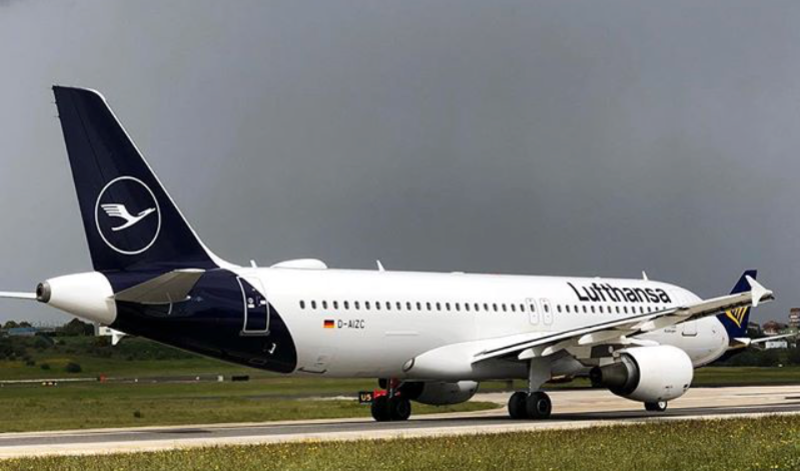
And it continues a trend trend in aviation liveries towards more bold single colors, such as in the new Lufthansa livery, which dumped the iconic golden crane from their tail logo. At least United didn’t follow the new trend of painting the whole empennage. I’ve always been a fan of the classic tail-only paint.
So, at the end of the day, United’s new livery is recognizable, which is important, but it’s certainly not going to win any design awards, at least not from me.